|
Walter Palmer is an American dentist living in Eden Prarie near Minneapolis, MN. Like many working professionals, Palmer enjoys pursuing a hobby, and his hobby of choice is big game hunting. In July of 2018 he travelled to Zimbabwe for an exotic lion hunting trip, guided by numerous local hunters. He was successful in taking a male lion on his hunt, but within a few weeks of returning to the United States, a London based news group discovered that the lion was 13 years old and revered by the local population. Though the hunt was not illegal and Palmer has never been convicted of a crime, many lives have been changed by the London news company publishing this story. Palmer endured a few weeks of online berating and local protesting at his dentistry, members of his hunting guide party are facing potential legal ramifications in Zimbabwe (even though the hunt may have in fact been fully legal), and Palmer’s family members have even been threatened multiple times. This situation occured because of a random news company publishing the story. Because of this, I do not believe this situation could have been fully avoided; Palmer had nothing to do with his private trip becoming public knowedge. Throughout all of the news coverage (including the Jimmy Kimmel Show where Jimmy Kimmel was in tears explaining the story), Palmer insisted on and repeatedly stated the facts about his trip, its legalities, and the conditions of the hunt itself. In this way, Palmer communicated with purpose and intent, knowing that his audience was large and covered many demographics. He maintained a repeated and clear statement of his actions being legal, and he had help from unpaid legal consultants to ensure his communication remained inoffensive. In addition, Palmer proceeded to reopen his business as soon as he could in order to “move on” from this incident. These steps and actions were choices, and have since relieved him of his temporary online popularity. Palmer’s situation has had a drastically different outcome than that of Justine Sacco, a PR employee. Sacco tweeted a picture and a complaint about two men sitting behind her at a tech convention making unneccasary sexual jokes. What she did not expect, however, was the severe backlash that would come upon her in addition to the two men who were promtly fired from their jobs. Sacco was also later fired after more online communication in which she, like Palmer, defended her actions. However, Palmer defended himself calmly and in a very small number of interviews/questions. Sacco responded in a defensive tone and sometimes out of desperation, and this did not help to settle the waters of the Twitter world. Unlike Palmer, Sacco did not quickly seek to “move on” from this incident which may have contributed to the ongoing struggle and losses she experienced. This method of responding caused Sacco to continually fall into more online shaming and did not prove to be an effective solution to her problem. There are many learning points to draw from these two examples of shaming in the digital world. However, the first and most effective way to ensure you do not become a victim of shaming is to be careful and considerate with the content you post to social media. In addition, be just as thoughtful and considerate when commenting on other posts. The shaming starts when people comment and critique others in a negative, mean, and offensive tones of voice. What would it look like if, when we disagree with something someone says, we simply either don’t respond or we do so in a kind and thoughtway manner? 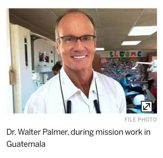
4 Comments
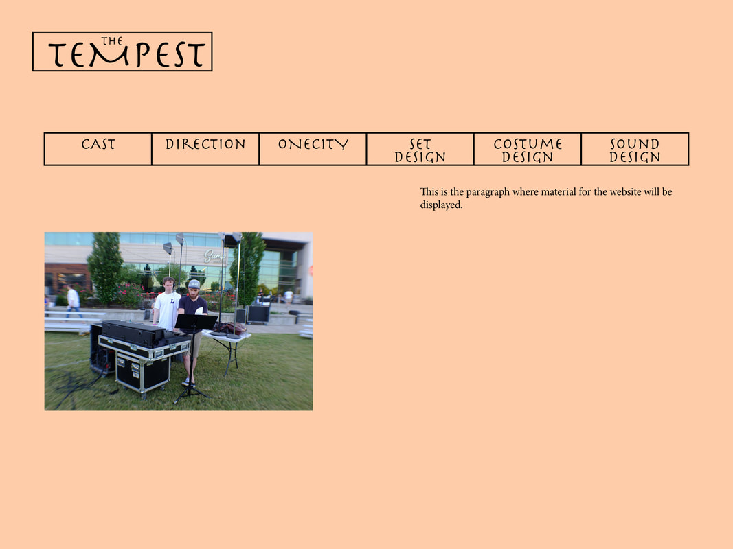 I attempted to create a website layout and logo in the most simple style I could envision. I am often drawn to websites that use extremely simple layouts, such as apple.com. This simplistic style allows the content to shine through and gives the consumer a feeling of control over how they are navigating the website.
My logo is representative of this simplistic thinking. I began with the two words “The Tempest” and used the various tools in Adobe InDesign to move and shape the words. I chose the Herculanum for the logo because it reminded me of older writing on scrolls written hundreds of years ago. I aligned the logo to the top left of the window due to the off-centered style of the logo; when placed in the center of the screen, it did not appear to be centered. The dip of the letter “M” in “Tempest” allowed me to lower the word “The” into the larger word “Tempest” which gave a unified look to the logo instead of just two words. I also chose to be repetitive in my font choice by using the Herculanum font throughout the headings of each main page for the site. I chose center alignment for the headings and placed them at the 1/3 mark of the page size, equidistant from each edge of the page. I then aligned both the image box and the paragraph box to the sides of the headings, as well as aligned their inside edge to the center of the headers. This created equal proximity between the boxes. I believe my website layout is a good starting point to base our class Shakespeare website upon. Though not artistically innovative, this site layout provides the user a clean, easy to understand, simple way to navigate the content of Shakespeare. 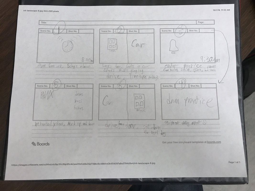 I plan to use longer shots in each frame, specifically scenes 3, 4 and 5. I also plan to attempt a time-lapse of my drive to Belmont and finding a parking spot in scene 2.
I designed my website as a self-promotion platform for me as a musician. I started with a very basic template from w3schools.com which contained the framework CSS and HTML for the page’s layout and style. I adjusted the header and footer sections to better fit the screen, as well as expanded the article section to allow for more room to display my content. I modified the colors of each section to have more contrast and simplicity. After choosing my color scheme, I chose my three pages to be an “About” page, a “Music” page, and a “Contact” page. Each page contained the same navigation links on the left-hand side of the screen allowing the user to navigate freely between the pages. At this point, I was ready to input my content, and I began by adding a headshot of myself to the “About” page along with my brief biography. I then added embedded YouTube links to my “Music” page, as well as links to my social media, main website, and email address on my “Contact” page. One particular challenge I faced was attempting to add images into the header section on both the left and right sides. I had to resize my images multiple times to find the correct size, as well as determine how to program the HTML code to maintain the header’s centered text box. Once I accomplished these tasks, I was able to copy the code to all three pages of my website and this gave the entire site a uniform design. My vision for the website was to create something similar to my main website built through Weebly.com. If I was fluent in HTML and CSS, my ideal website would look something like that website. The navigation interface is more smooth and fluid and is more visually appealing on my website created through Weebly. In addition, the animations made possible through Weebly are more attractive than the rough transitions of my HTML site. However, with my level of experience in coding, I am very pleased with my end result. I focussed on the visual and spatial modes while designing my website. Visually, I wanted to create a clear contrast between sections of the website to draw the user towards the important sections (such as the main content section “article”). I achieved this contrast by darkening the header and footer as well as lightening the navigation and article sections. Spatially, I chose to shrink the navigation section to allow more room for content in the article section. I also expanded the header and footer to further fill the entire screen, as well as increase the font size of the header. Combined, I hope these choices will portray a simple yet appealing image of me and my content. My intended audience of this website is anyone seeking a professional pianist/keyboardist. Similarly, the purpose of my website is to advertise my services and demonstrate my abilities as a performer. The context and genre of my website fall into the “biographical” category, because I am seeking to inform potential employers of my skills and education as a performer. Similarly to most personal resume websites, I am the author of my website and provided all information contained within the website.
The Royal Shakespeare Company The England based Royal Shakespeare Company’s archive serves a wide range of audiences. It contains basic information for someone who is not acquainted with Shakespeare, yet is also includes details of Shakespeare’s life and work that even a seasoned Shakespeare audience might not know. For example, one tab of the website lists many famous quotes and sayings that are attributed to Shakespeare and have become part of American culture. Another tab gives a detailed timeline of Shakespeare’s life, including some more obscure details. By combining both broad and detailed information, the website reaches a broad range of audiences. The RSC’s purpose is best defined by their own “About Us” page on their website which states, “We want as many people as possible to be able to access theatre at its best, so we bring our work to the widest possible audience…” They continue by listing the numerous ways they endeavor to reach people through TV, websites, live theatre, education and more. Similarly, in a page dedicated to their mission in the next 3-5 years, the RSC states, “Our purpose is to ensure that Shakespeare is for everyone.” In addition to the goal of bringing Shakespeare to the general public, the authors of the website also provide a recruitment point for donors to contribute to this goal. The “Membership” page list the benefits you may receive by donating to the RSC and gives information needed to obtain tax-deductions for the donations. An online store also allows a visitor to support the organization by purchasing various accessories and gifts. The RSC’s historical context extends to almost 150 years ago in the year 1875. The first RSC tour of the United States was in 1913. Since then, multiple RSC theatres in England have opened and closed for renovations. In 2011, the Queen of England officially opened the new Royal Shakespeare Theatre. Throughout the “History” page, the website audience is given a detailed timeline of the company’s events and landmarks. No information on the website suggests any specific authors for the information on display other than the RSC itself. This follows a similar pattern found on other archives of Shakespeare’s work. I would place this website in a genre similar to that of non-profit organizations or other museum or informational websites. The timelines for both Shakespeare and RSC provided on the website, as well as the general “About Us” page, are great tools to help an audience understand Shakespeare. They provide information to amateur and experienced audiences as well as help to navigate the user through the maze of Shakespeare plays and information about Shakespeare. In addition, the information given about Shakespeare’s language and life is very helpful to someone who is beginning to understand the context of Shakespeare’s time. The “Language” section provides the reader with links to other articles to better understand the poetic language used by Shakespeare, and the “Life and Times” page gives a brief but personal biography of his life. These are the features of the archive that I would most like to apply to our own archive in the future. The Royal Shakespeare Company’s website is clearly carefully planned and intentional in it’s goals of reaching a wide audience in as many ways as possible. By combining timelines, history, pictures, quotes and more, the viewer is kept engaged in the website’s content. I would not change anything about the website. This website is a great example to follow when considering materials to add to our own Shakespeare archive. 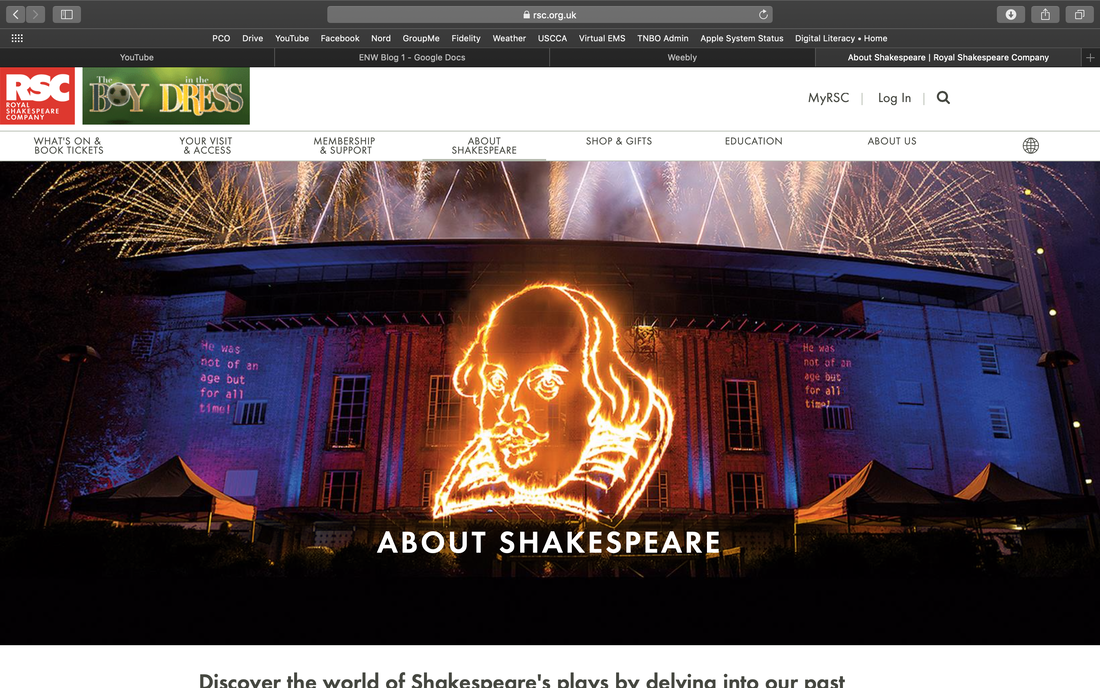 |
AuthorWrite something about yourself. No need to be fancy, just an overview. ArchivesCategories |
||
 RSS Feed
